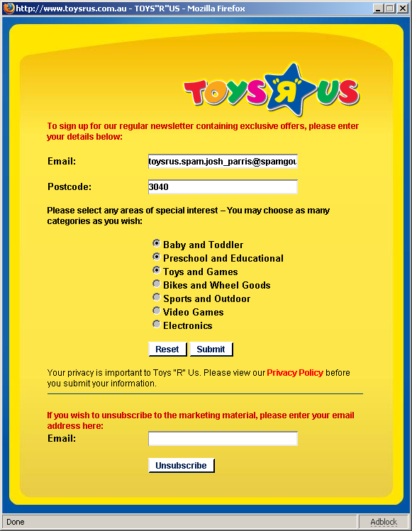
Want to see some HTML Form stupidity? Go to http://www.toysrus.com.au/site/signUp.htm and you get:

Radio buttons – users know what to expect from them. You can pick only one option. Not these puppies. These happen to be round checkboxes – that you can only turn on. You can’t turn them off! Oh, sure, there’s a “reset” button down the bottom of the form, but can you recall the last time you pressed the “reset” button on a form? I don’t think, in my many many years using the ‘net, I ever have. Not once. I have “reset button blindness”, and I imagine a bunch of others do too.
To top this off, because the site is mainly Flash, figuring out what the address of the page took a while. In the end I had to bookmark it to find it.
I guess that’s what happens when you get schoolchildren to build your website.

Maybe you don’t have Reset button blindness when there’s no other way to turn off the options you’ve chosen!