Category Archives: Design

Pointless choices

This seems to be common on store finder applications on the web: After entering the postcode, you’re asked to enter the suburb as well.

coles

It makes zero difference what you choose, because the suburbs aren’t huge. The Store Locator shows you stores within at least 5 kilometres, but the suburbs are much smaller than that.

In fact it’s worse in the case of the Coles Catalogue, because it ends up giving you a catalogue which is clearly marked “Vic Metro” – which applies to the entirety of scores of postcodes.

Is there anywhere in the country that has suburbs big enough that it would matter? I haven’t found any.

Making people make this choice is pointless. It’s just another barrier to them getting to your information.

Thunderbird does error message wrong

Thunderbird discovered that yahoo have changed their mail server’s POP3 behaviour, meaning you can’t leave mail on their server and download it locally. So it pops up the following message box:
POP3 has failed
This message box is app-modal. You can’t just fix the problem, you’ve got to take notes (a screenshot suffices) and then fix the problem. A bunch of faffing around, when it could have just said “Do you want your Server Settings automatically changed so that your mail can be fetched? Yes/No”. Or you could have this pile of technical information in a non-modal dialog box, and bring up the settings dialog for the user to solve the problem. Or just have this pile of technical information in a non-modal dialog box, so a screenshot isn’t necessary.

Or you could just make people angry, that works too.

This Is Broken is broken

This Is Broken used to be a terrific blog — simultaneously entertaining and educational (at least for those of us who have anything to do with building or implementing interfaces of any kind).

But now it’s broken. It’s all migrated into the Good Experience Blog, which might be okay in principle, but it dilutes all the Broken stuff that was the most fun. I don’t want to read job offers for North America. Nor am I particularly interested in many of the articles. And while you can view just the Broken articles on the web, there’s no RSS feed for just those posts.

(I’d leave a comment to this effect on the This Is Broken post that announced the change, but comments are closed. Which is also broken. Someone else left the same comment, anyway.)

So I’ve unsubscribed to the Good Experience RSS feed. There is a Flickr group that is still dedicated to broken stuff, though its attached RSS feed appears to link to an inactive discussion forum.

Tell me how to fix the problem!

It timed out, or I closed something, or something. Then I tried typing, and Writely figured out I couldn’t prove I was me anymore:
Not logged in - fine. What do I do about that?
Not logged in – fine. But you’re meant to tell me how to fix the problem, or better yet, fix it for me.

Eventually I brought up the login screen in another tab, logged in, and all became good again.

Maintenance nightmare

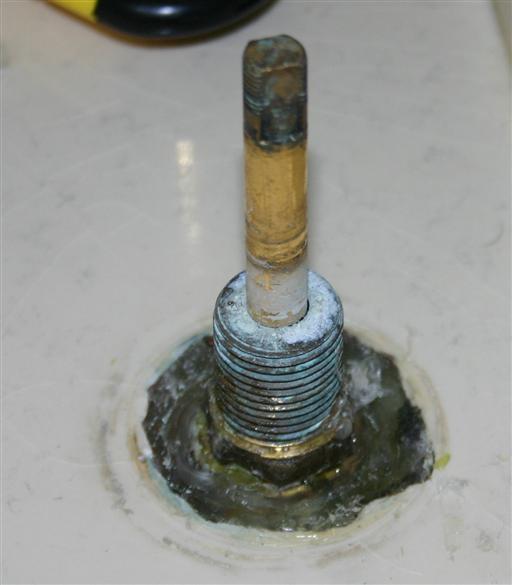
Unmaintainable Plumbing - kids, don\'t use silicon sealant to hold plumbing in place
Houses need maintenance, it’s just a fact of life. Things wear out. But programmers are not alone in creating artifacts without thought for the subsequent fixing of the going wrong of things.

Take a look at this tap. This tap is copper, as you can tell by the oxidation. Inside it is a washer that, as a function of how many times it’s been opened and closed, now needs replacing. This is normally a simple matter of turning off the water supply to the house, unscrewing the tap body, popping out the old washer and slipping in a new one. But if the plumber or whomever followed in their footsteps decided to make things more watertight by the liberal application of silicon sealant, you’re in for some fun times digging it all out so as to be able to get a spanner onto the bastard of a thing.

The plumbing all through my spacious bathroom continues in a similar vein.

One of the shower taps can’t be removed with a spanner because it’s too deeply recessed into the wall. So deeply recessed that the tap had to be extended out so that the cover could screw on. But rather than extend the tap out via a pipe extension, the tap was extended out with a thread extension. So, joy of joys, I can’t change the cold water washer.

Part of the house maintenance was to install a Residual Current Device, a saftey switch. This protection extends to the spa bath’s pump, which is how we found out the pump has a leakage problem – switch the pump on, and the whole house is plunged into darkness. Should be a simple matter of locating the pump, determining where the unit has degregated, and replacing it. If, say, it was externally mounted. Which it isn’t. I believe it’s mounted under our bathtub, in the cavity between the tub and the wall. There is no way to access this area, not via a removable panel or anything of the ilk – the whole lot has been tiled in. Which tile should I remove to get to the unit? The left hand side or the right? No one knows. Naturally, there are no spare tiles to replace any that get broken in the search. For all I know, the pump may be under the floorboards, but the bathroom’s just about as far as you can get from the underhouse access trapdoor, and I haven’t gotten up the courage to go looking for it yet. If the pump’s not under there, I hope there is under-floor wiring that will give a hint as to the location of the pump – but I’m not holding my breath.

What home maintenance nightmares have you seen as a function of poor design?

Visio and database creation

For quite a while I used Visio 2000 Enterprise Edition to design database schemas, and then have it create and update the tables. Admittedly the Visio 2000 interface is a little cumbersome for such things: it’s overzealous on its checking before you can update the database, and just try and delete a relationship without the sky falling on your head — it somehow thinks some kind of underlying link is still there, and if there’s anything wrong with it, it refuses to play ball. But when it behaves, it’s an excellent timesaver.

The other week I upgraded to Visio 2003 Professional Edition. Somewhere between 2000 and 2003 they’ve scrapped the Enterprise Edition, and although Microsoft don’t specify it in their literature comparing editions and versions, gone too is the database creation stuff. Apparently they’ve moved that functionality into Visual Studio Enterprise Architect — which Joel On Software describes as the super expensive “Enterprise Architect” edition at the top of the line that hardly anyone ever buys; it’s only there to make the other prices look reasonable by comparison. Great.

In Visio 2003 you can still draw database designs, or even generate them from existing databases, but there’s no way to create the DDL (SQL) for them, or update/create the databases themselves. I spent a couple of hours searching vainly through the Visio menus (the “Database” one is particularly deceptive) looking for such options, but couldn’t find them. I did find stuff pertaining to outputting a bunch of data describing my database diagram, but nothing would let me create the database I’d meticulously designed, or even print out a list of the fields and their types and sizes.

I have Visual Studio 2003, but for various reasons it’s the Professional Edition. So I couldn’t get my lovely design into the waiting and ready Oracle database. On the Visio 2003 Save As, it lets you choose “Visio 2002”. I wondered if by some fluke Visio 2000 would read a 2002 format. So I saved it, removed Visio 2003, installed Visio 2000 and tried to load it up.

Eureka, it worked. There was some further messing with it to get around a relationship on the database that was causing an error, and which I eventually decided I wanted to delete (an impossibility in Visio 2000 — see above) but eventually I got my DDL and indeed managed to create my glorious Oracle database.

But really, it shouldn’t be this hard.

Money

It’s a few months old, but this article is a great read — telling the story of (some of) the history of Microsoft Money.

During the heady dot-com days, when all reason was tossed to the wind, Money’s success was measured against the same metrics that other MSN properties (read: “websites”) used.

Metrics like minutes viewed per month. Like ad revenue. Like click-through. Stickiness. I am not making this up. I sat through meetings where we were asked to research ways in which to increase the amount of time that users spent in Money. Increase the amount of time!